JOIN JANE CONTINUING TO MAKE SENSE OF ART
And this month Jane is exploring the mysterious world of the Print.
An antique engraved print of Tavistock

Go to any art fair and you will find a huge range of different art – sculpture, ceramics, paintings in oil, watercolour and mixed media, and prints. It is easy to be dismissive of prints opting for originals, as few of us really understand the processes involved in print making or the history of it. Even though my grandfather was a linocut artist and my mother-in-law an etcher I am embarrassed to say how little I know about either process or any other print techniques. This month I am endeavouring to understand the basics – and what we should look for in a print.
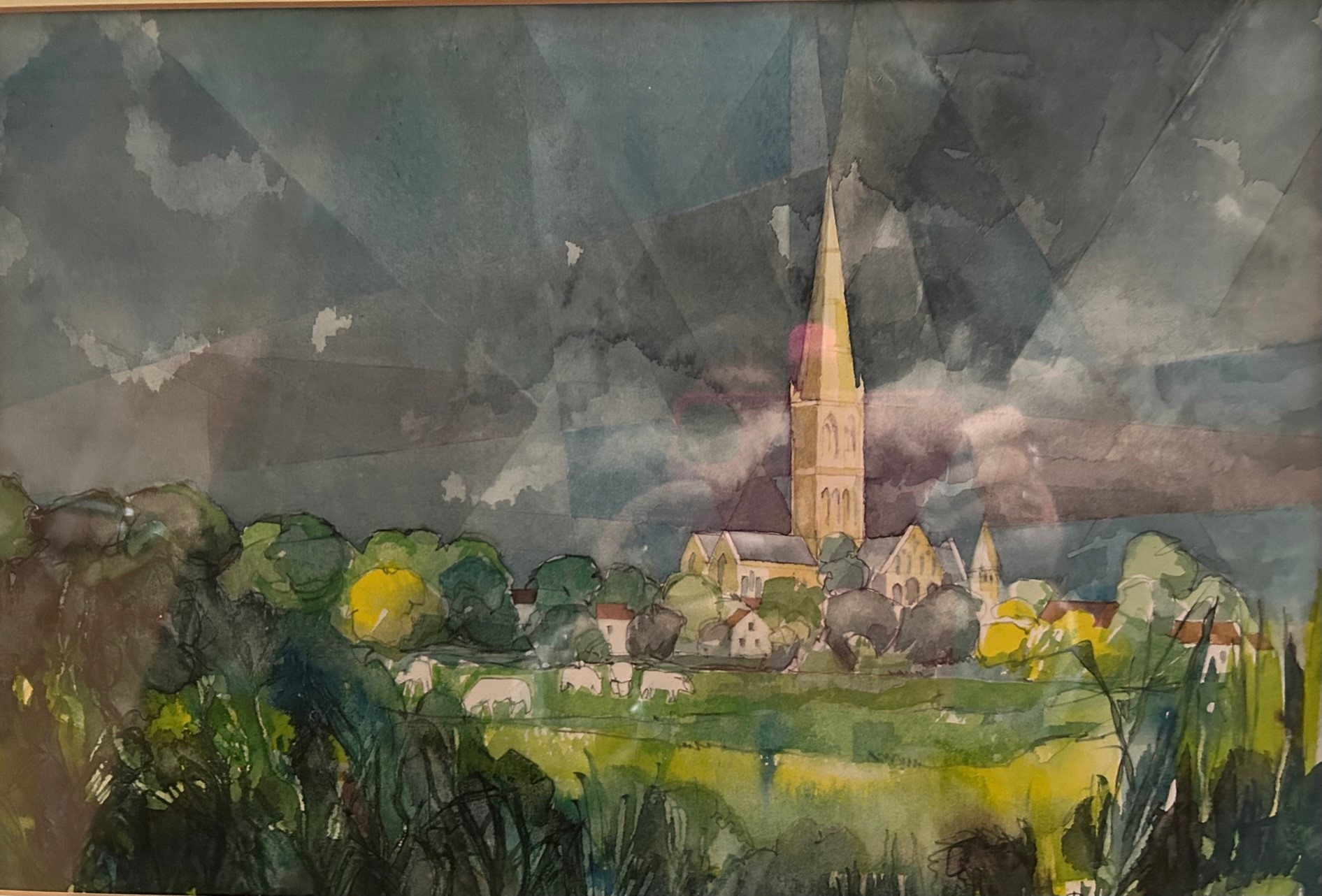
So what exactly is a print and why is it a bit of a complicated world?
Well – in its simplest form a print is an image created on one surface which is then transferred to another in a process which is repeatable, therefore enabling the production of multiple impressions. The number of impressions is either limited by the quality of the process and materials or as is generally the case today, limited for commercial reasons. The lower the print run the more value the print will have. It is interesting to note that the original work of art is not the block or plate from which the prints have been made – it is the prints themselves. I find this extraordinary as blocks and plates are where the artist works his/her magic!
Before the arrival of digital printing there were 3 main printing processes;
1. Relief printing – woodcut and linocut. This is where the image is carved into a wood block or piece of lino. Woodcut or woodblock printing was the first form of printing – originally used on textiles in Europe but in the 15th century was used to print images on paper for books like the Bible and missals. There are also examples of woodcut playing cards from that era. In the 16th Century the German artist Albrecht Durer explored the expressive potential of printing, producing a set of religious scenes.
2. Intaglio – engraving, etching, aquatint and mezzo tint. This is the reverse of relief printing – the image is cut into the surface of a metal plate. When the plate is inked the ink is pushed into the lines. The plate is then passed through a press with a sheet of dampened paper which pulls the ink out of the lines onto the paper. Both Rembrandt and Goya used this method.

“Poppies” an etching by
Brenda Julie Young
3. Planographic processes – lithography and screenprint. Planography is printing from a flat surface – relying on the fact that water and oil do not mix! Lithography (‘litho’ means stone and ‘graph’ means to draw) is the most complex printing process. The artist draws directly on to the stone or metal plate. This is covered with ‘tusche’ – a greasy ink which is then coated with a water based liquid. The ink only adheres to the lines of the drawing as it is repelled by the wet areas. Paper is then applied to the plate/stone and pressed. The mirror image of the drawing appears on the paper. Karl Martens is a master of lithography – see Kingfisher below.

Screenprinting was widely used in the 1960s and 1970s for fine art prints and posters. The most famous is perhaps Andy Warhol’s portrait of Marilyn Munroe. Sir Peter Blake’s Beatles album covers also used this method. This is a limited edition print by Sir Peter Blake.

This shows how perfect this technique is for blocks of colour. An ink blocking stencil is created and added to a fine mesh (sometimes silk) screen which acts as a barrier when the ink is passed across the screen. Separate screens are used for different colours. The example below is a more subtle silkscreen print of a horses’ head by Nic Fiddian Green.

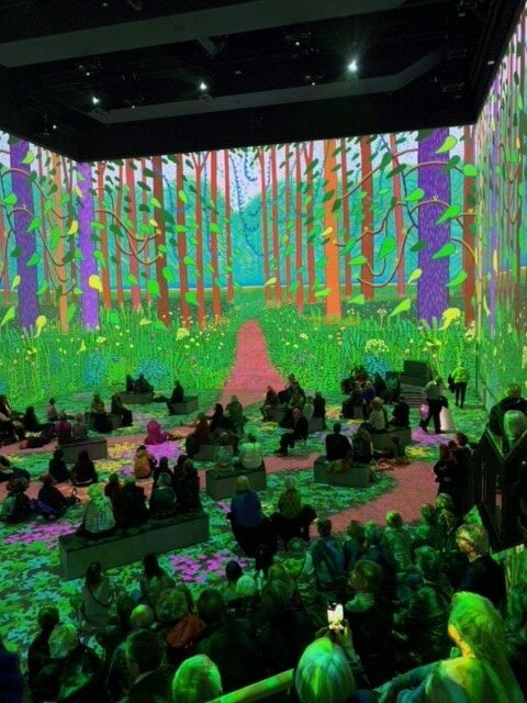
The development of digital printing has opened a whole new world – it has become an inexpensive way to reproduce fine art – but there are many artists using it to produce exciting original art. This, of course, is something that David Hockney has been playing with over the last few years – art created on his Ipads and then printed using inkjet printers – as seen at the David Hockney Immersive experience – still on in London.
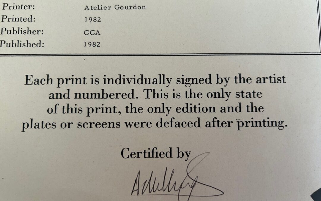
The problem over buying a print doesn’t end once you know what sort of print you are buying – you need to know whether it is a limited edition print, and if it is, how long the run is. This factor will certainly affect the price of the print – and in the future, for a well known artist, the long term value. In general, the shorter the run – the better. This information is usually given in the left hand corner in the form of a fraction. So the one below is number 21 of a run of 100. In my next post I will do a glossary of print terms – not very exciting – but hopefully useful if you have some prints on your walls.
